© 2024 Pooja Malvi
Backpack

MY ROLE
Lead Designer
Timeline
6 months
Team
4 Designers
3 Developers
Scaling Lyearn products with 2x speed by bringing consistency in visual components and encouraging collaboration through design system
Problem
Lyearn provided a platform to deliver essential sales training and enhance the skills of employees. During my 3.5 years at Lyearn, I faced the challenge of building scalable design systems in a fast-paced, product-led environment with shifting business priorities and team reorganizations. Without a consistent system, UI patterns fragmented across products, documentation was incomplete, and developer handoffs were often prolonged. To address this, I created a design system - Backpack - that brought structure, consistency, and efficiency to our workflows.
Key Issues -
- Inconsistent UI patterns emerged across multiple product features
- Lack of clear documentation left designers disoriented and slowed onboarding
- Error-prone developer handoffs resulted in mismatches between design and built output
Goal of the redesign -
- Establish visual and interaction consistency across products
- Improve onboarding speed and empower newly hired designers
- Build effective documentation and handoff guidelines for clarity
Impact
After 6 months of collaboration with developers and designers, Backpack design system resulted in cohesive workflow to build new features on top of old system with ease! Here's how it helped the team-
27% reduction
in UI bugs during post-development audit
20% faster
Feature delivery, enabling teams to keep pace with business pivots
80%
Improvement in developer handoff process
~ 2 months
onboarding time (previously 3 months) for new design hires

TLDR of my contribution to the team :)
Final Solution
Backpack Design System was launched during a company wide reorganization, it streamlined collaboration across a distributed design team of 6 designers and ensured consistency across new features.
In both systems, I partnered closely with design and engineering leads to ensure design-code consistency, developed accessible, reusable components in Figma (with tokens, variants, semantic structure, and dark mode support), and documented them with clarity for cross-team adoption.
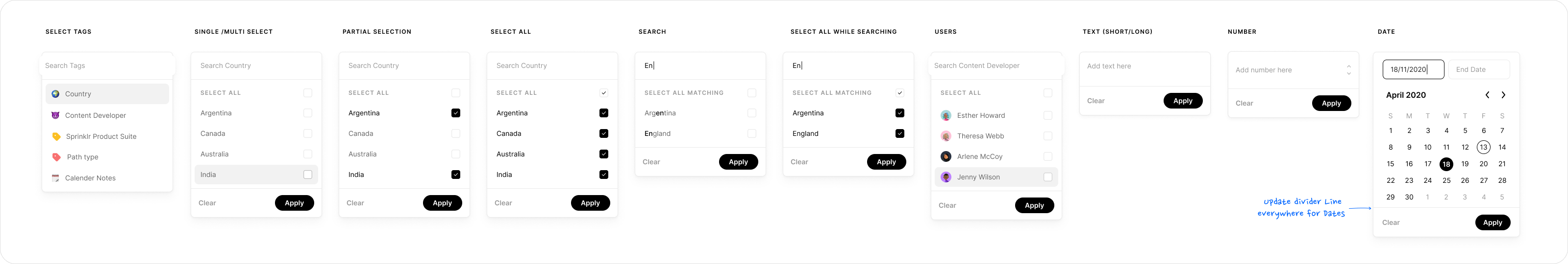
Scalable Figma Libraries
Built reusable components, tokens for spacing, typography, and dark mode plugin support
Documentation Structures
Notion and Figma guides for component and variables
Handoff Guidelines
Created nomenclature, and custom learning materials, improving trust with engineering partners
Audit & Critique cycles
Established audit & testing cycles after each sprint to verify design <> code accuracy
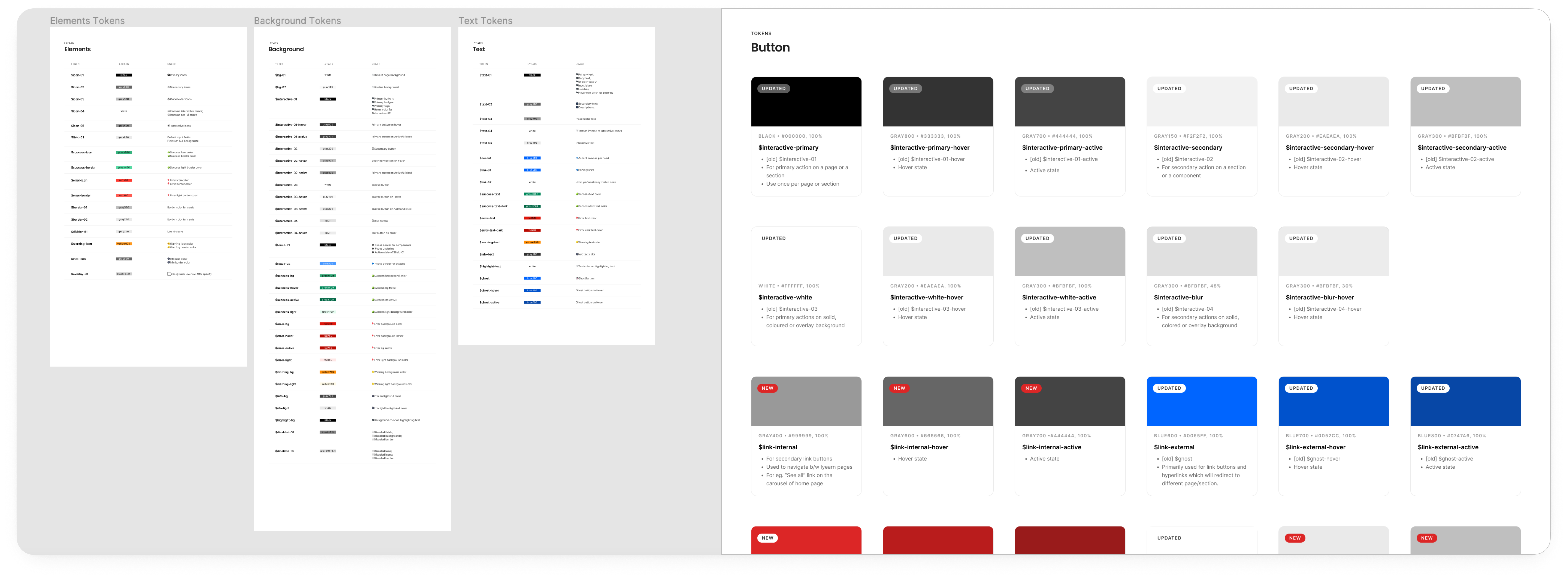
Before vs After streamlining documentation for color usage in Backpack Design System
Process
Since the project migrated a lot of existing features from the old system, we tried to follow an ad-hoc method to redesign it for the new architecture. The process over the time simplified into these 4 steps:
1. Creating
Transitioning all assets to Figma in Atomic Design System format
2. Collaborating
Decentralized ownership by assigning sole component owners
3. Documenting
Communicated intent and clarity behind each change
4. Auditing & Learning
Switched from one-way updates to cross-collaboration sessions
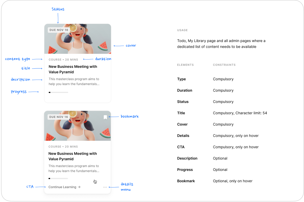

Documention for components and token variables
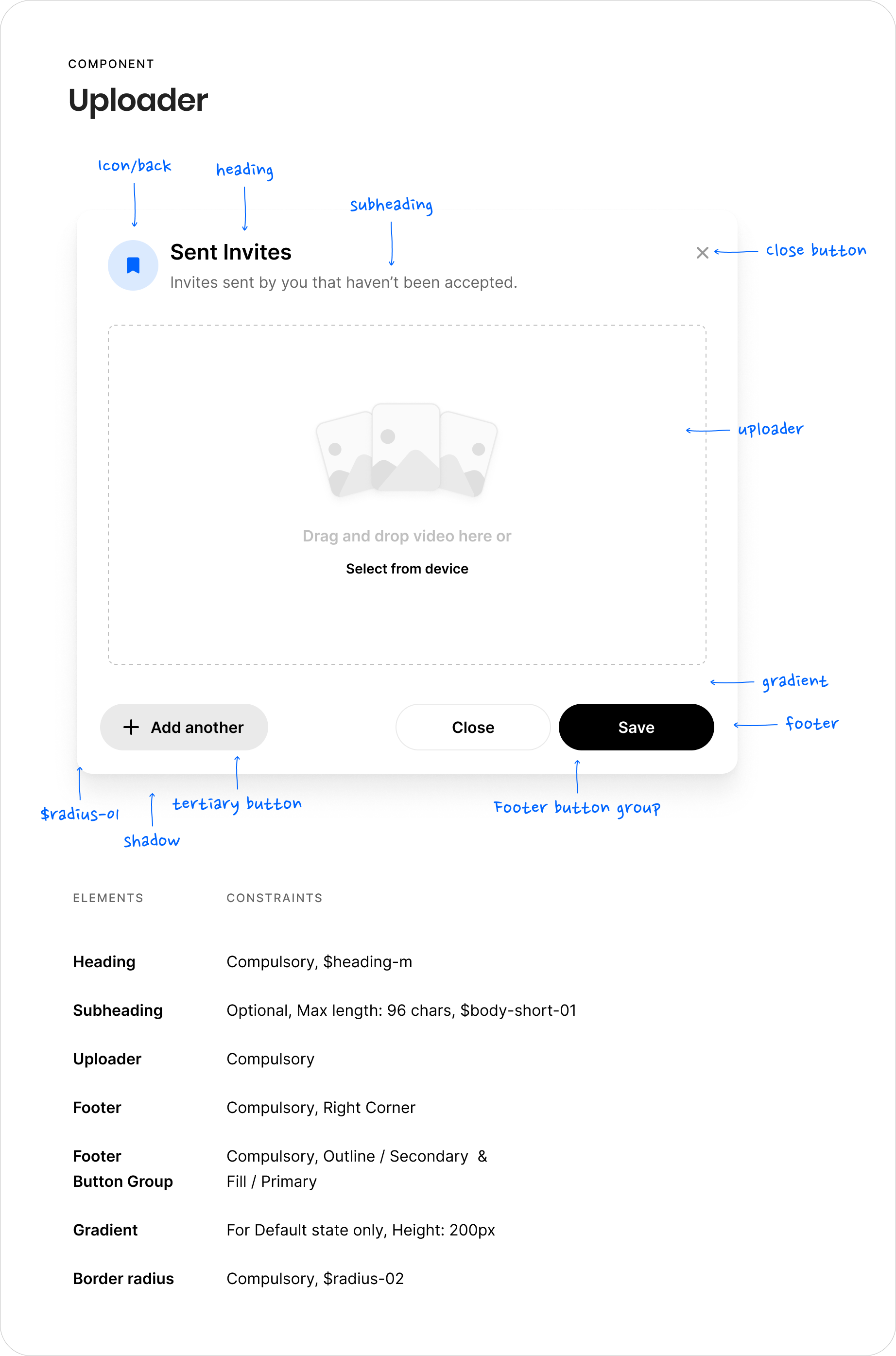
Component states and nomenclature documentation in Figma
Outcome
After gaining a comprehensive understanding of the entire user flow and information structure, our next phase involved refining the user interface. This aimed at not only optimizing the existing handoff workflow but also ensuring everything worked according to the documented components . Here's how the final component looked like on the products. I created a course for new hires to learn more about what each name meant and hosted it on our internal platform.
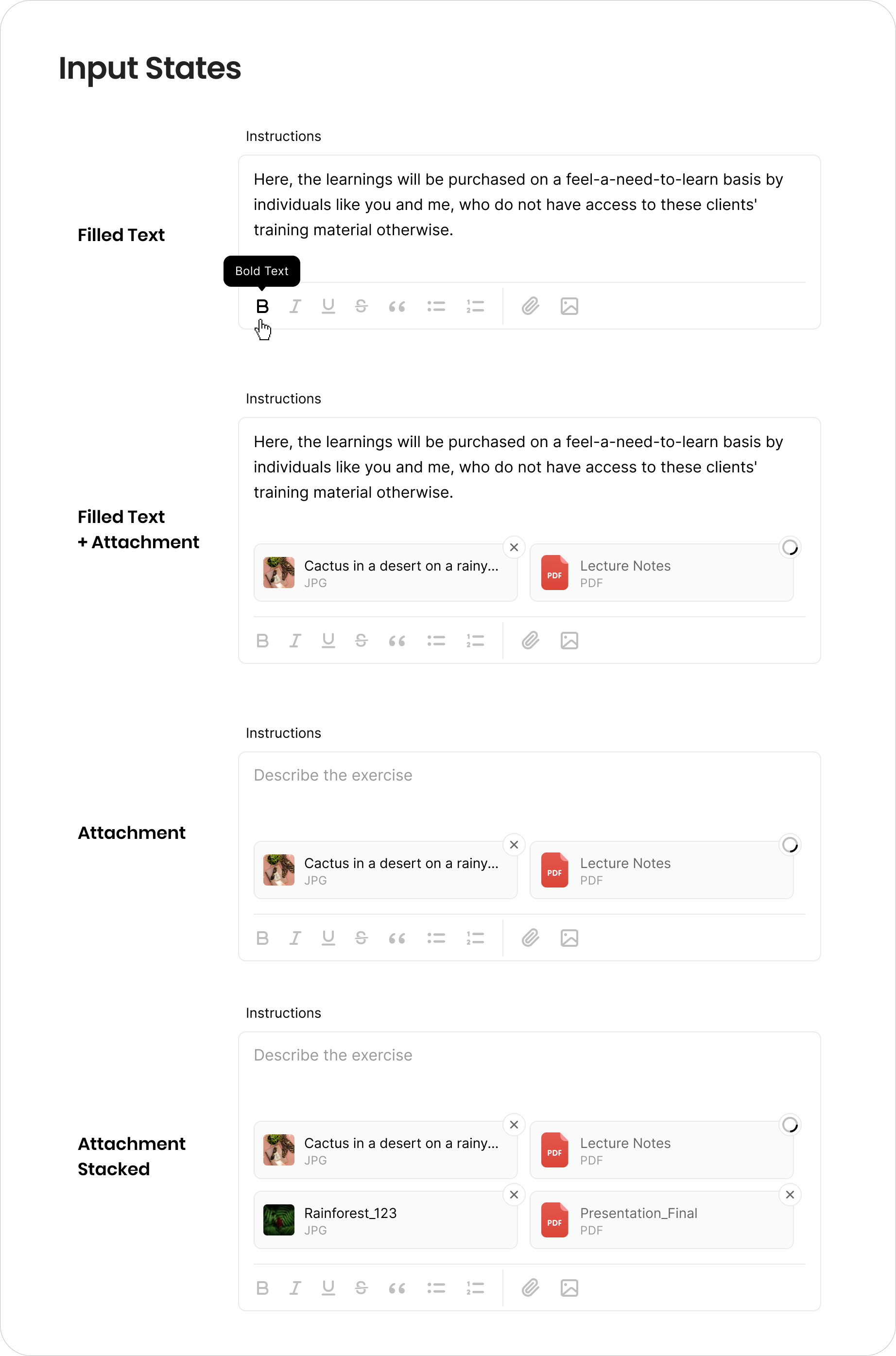
Shipped final UI variations of each component types

Internal course and documentation library hosting on one of our Lyearn Products

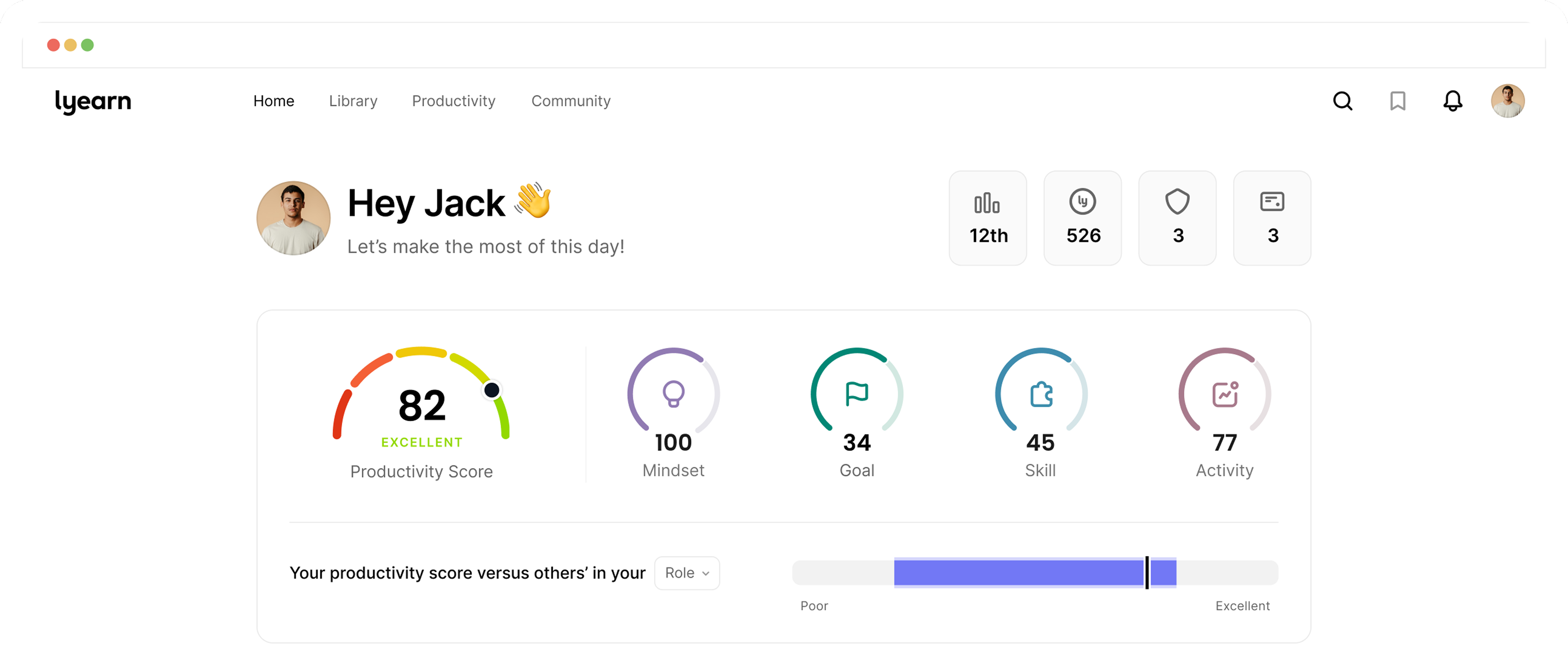
Consistent UI & visual language across all products
Takeaways
Building Backpack taught me that design systems are more than libraries of components, they are living frameworks that shape how teams collaborate, document, and deliver at scale. By developing scalable, accessible Figma libraries, creating dark-mode–ready tokens, and pairing them with clear documentation and onboarding processes, I was able to transform fragmented workflows into cohesive systems.
Challenges that I overcame -
- Overcame fragmented workflows during the Sketch → Figma transition by building new file structures and reusable tokens.
- Tackled the lack of documentation and solved it by keeping design-developer collaboration in mind.
- UI Simplification: Reusing components from irrelevant features helped simplify creation process.
process
01research
insights
Checkout next project